December 30, 2021 | Company Announcements
Roland Foods Rebrand: A Heritage Fine Foods Brand Steps into the Future
Roland Foods has been a purveyor of fine ingredients since 1934. Over our 85+ year history, we’ve cultivated countless relationships with vendors, suppliers, and customers and have sourced thousands of sought-after fine foods from across the globe. We’re proud to have been, and continue to be, part of meals that are created in restaurants and home kitchens all over the world.
As a global fine foods brand, we understand the necessity of being adaptable to changing landscapes – whether that be actual agricultural landscapes or shifts in supply chain and the consumer marketplace. And with our adaptability comes a natural brand evolution, which is why we are very excited to introduce our updated brand identity today.
An 85+ Year Old Fine Foods Brand Gets a Fresh Look and Feel
What We Did
We set off to reinvigorate the Roland Foods brand in early 2021 – from color palette to packaging and brand tone.
In working with the Pearlfisher creative agency, we established an updated brand look and feel that encompasses Roland Foods' beliefs, values, and mission while still honoring our unique company history and heritage. The new brand identity incorporates an updated logo and visual elements, as well as vibrant color, pattern, and global representation across our new package label designs.
Why We Did It
Roland Foods was established in 1934 and since then has been known as a trusted purveyor of fine global ingredients. Our founders, Bruno and Suzanne Scheidt, were immigrants who brought the business to the United States and grew it by expanding the portfolio of products sourced from around the world. We still maintain strong relationships with the growers, suppliers, and vendors with whom we've worked for years, ensuring we deliver the highest quality fine ingredients to our customers.
At Roland Foods, our history and heritage are extremely important to us, but so is our focus on the future. We knew we wanted to bring our established brand into the modern day by spotlighting values important to us – especially culinary innovation and the celebration of diversity. We are also focused on connecting with younger consumers and wanted to refresh the brand in order to appeal to new and future generations.
Roland Foods Brand Elements
Our rebrand incorporates many new brand elements, from colors and patterns to logos, layouts, and typography. Learn more about the updates below.
The Color Palette

A refreshed color palette gives our brand a modern and bold feel, with a neutral primary palette and a vibrant secondary array of hues. The palette evokes our brand reliability and strength, but also brings forth the warmth and relatability of Roland Foods.
Our Logo
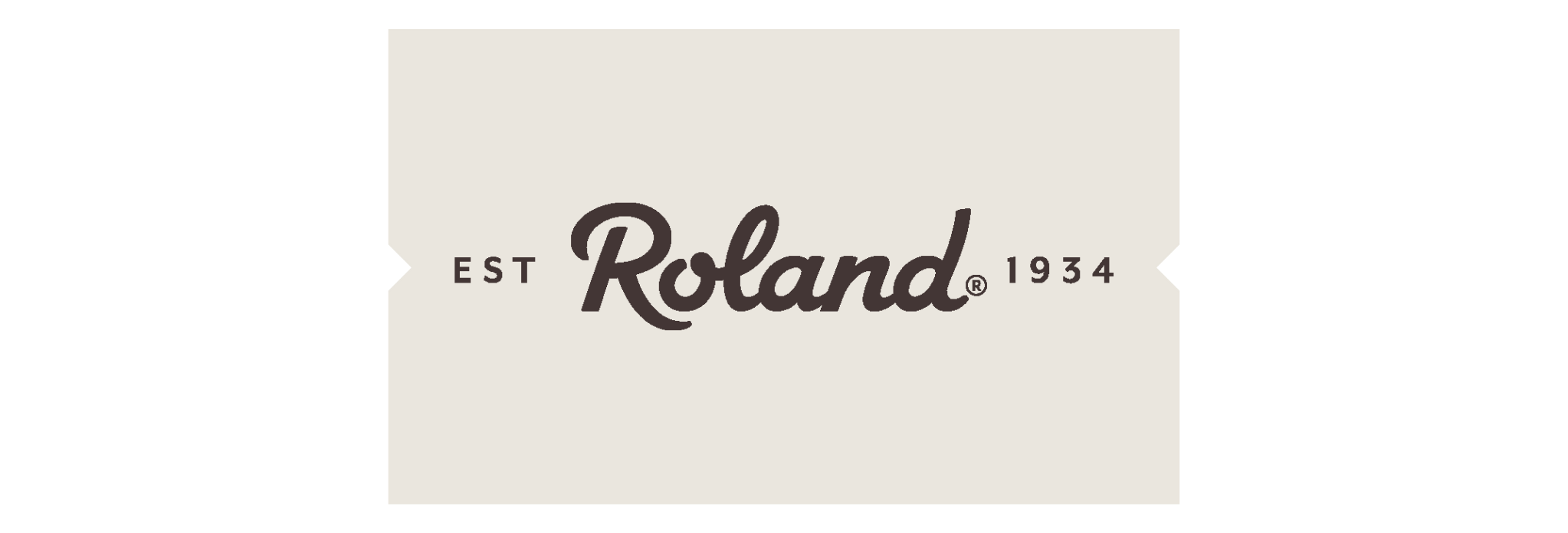
The Roland Foods logo is the cornerstone of our visual identity. The logo amplifies our rich history and heroes the trust in quality. With its new update, which incorporates our 1934 established date, our logo pays homage to our heritage while maintaining trust with the community.
Our Seal

A newly created addition to our suite of logos is our seal, which includes our tagline “Purveyors of Fine Ingredients,” as well as our established date. The seal represents Roland Foods’ authentic stamp of approval on our line of products and gives a nod to our rich history within the fine foods industry. A symbol of authenticity and quality, our seal represents Roland Foods’ position as a trusted purveyor of fine global ingredients.
The Table
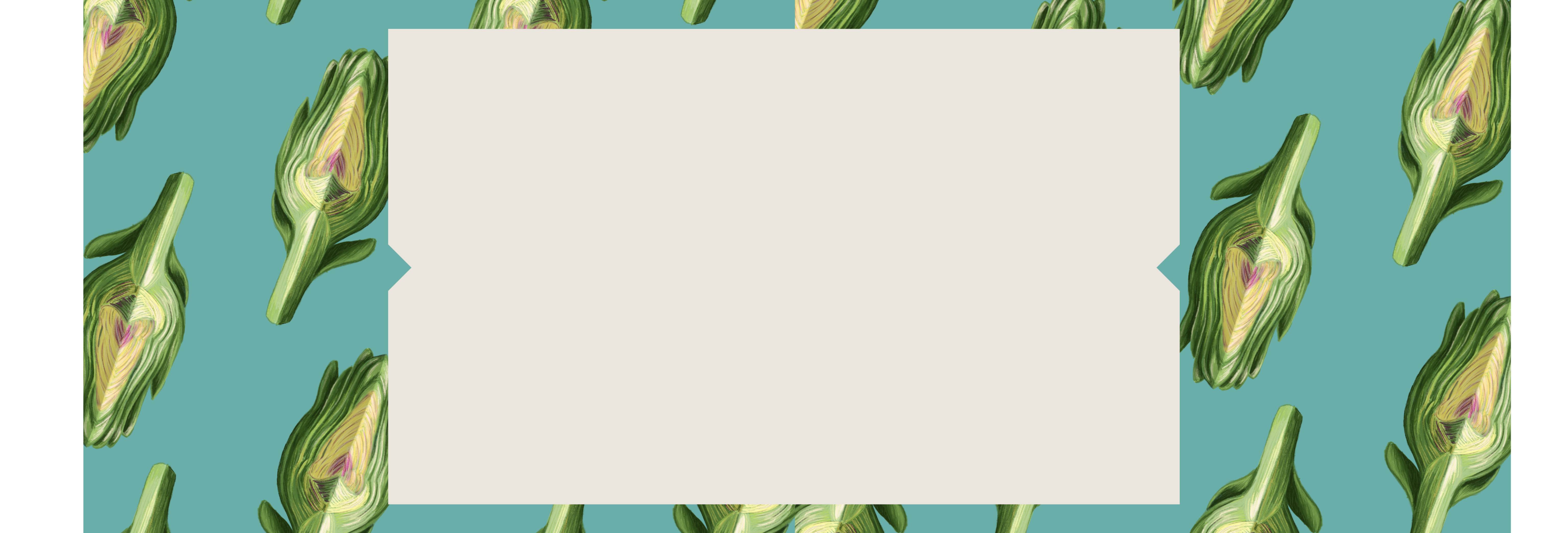
Another visual brand element is our newly introduced table. A table is a place where people gather to connect, share, and enjoy. Symbolically, it represents unity, diversity, and connection; a table has a universal power to bring people closer through culture, new ideas, and unique experiences. Our Roland Foods table is the bridge that connects us, not only to each other, but to the greater world. Our table can be found across our label packaging, serving as an anchor point to the design.
The Notches
As part of our table design you will notice our notches, the two triangles at either ends of the table. Our notches are yet another tribute to our heritage and portray our brand’s worldliness; the design for the notches were inspired by travel stubs, which is fitting for the global identity of Roland Foods. The notches are symbols that connect our past to the present and connect the Roland brand to people across the globe.
The Descriptors
Many of our packages feature vertical text on the outer sides of the table. These descriptors give consumers a better understanding of the flavors and usage of our products, so they can begin to visualize how to use the ingredients even before tasting them. Our team of foodies taste-test all of our products in-house so we can best describe their flavors, textures, and unique qualities on our packaging.
The Package Design
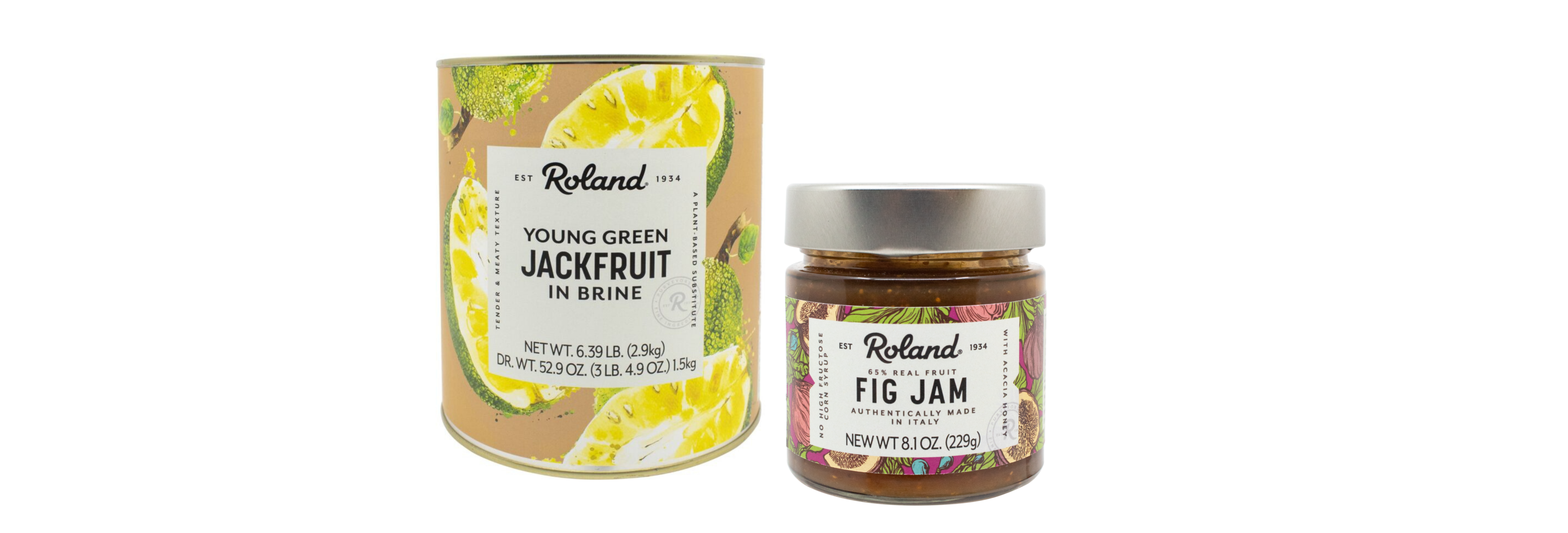
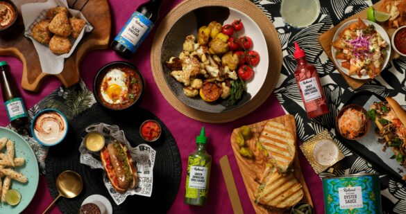
Arguably the pièce de rèsistance of the entire rebrand is the artwork on our packaging. We put a lot of thought and effort into the visuals on the packaging, ensuring the designs are both eye-catching and meaningful. The artwork across our portfolio of products is diverse, keeping in line with the ethos of our brand.
Our package design runs the gamut, from detailed product illustrations to abstract patterns and texture. Some of our global ingredient packaging also features core cultural elements from the places they originate from. The subject matter of these illustrations are motifs that represent a region through landscapes, landmarks, sceneries, iconography, or symbols.
Our updated package illustrations truly express Roland Foods' global reach. They are representations of different cultures and cuisines from around the world and speak to the idea that Roland Foods provides variety by bringing global ingredients to kitchens and homes everywhere. Plus, they’re fun to look at!
The Tone of Voice
As an established fine foods brand with such a rich history, we knew we wanted our language and identity to match our values, beliefs, and mission. If Roland Foods was a person, she would be an avid adventurer and fervent food writer well-known for her authenticity, inquisitiveness, and zest for life. With that mindset, we established guidelines for how we want to communicate with the world. Down-to-earth and descriptive with a sophisticated slant best describes our approach.
The Tagline
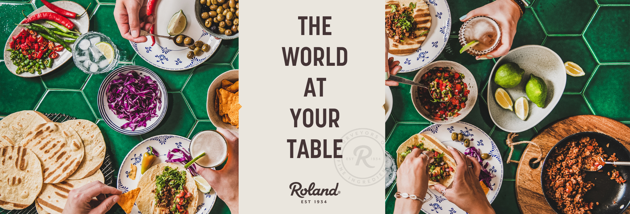
As part of this rebrand, we wanted to introduce a new tagline that encompasses our company values and mission in a succinct and memorable way. Taking into consideration our focus on premium global ingredients, our encouragement of culinary innovation, and the celebration of diversity in all aspects of life, we settled on one we’re proud of:
The World at Your Table.
A testament to our dedication to our customers and to our sourcing of the finest foods from all over the world, this tagline evokes what our brand is all about – bringing ingredients from across the globe to you, along with the inspiration and encouragement to create memorable meals.
Taking Cues from Our Rich History, Looking Toward the Future
To quote philosopher George Santayana, “to know your future you must know your past.” At Roland Foods, our history and heritage are extremely important to us. Even with our eyes on the future, our company history serves as a constant reminder of why we continue on the path our founders forged over eight decades ago. Our mission of providing premium fine ingredients to people across the globe is the same now as it was then, as is our commitment to diversity, meaningful relationships, and innovative sourcing.
Although we’ve modernized our branding, you will still see nods to our heritage throughout the creative. Learn more about Roland Foods’ history and heritage here.
A Foray into the Future of Fine Foods
At Roland Foods, we’re excited to navigate our next chapter with our brand identity in mind. With a focus on a deeper dive into the retail sector and a continued hunger for innovation, at 87 years young, we feel like we’re just getting started. Join us on the journey.
To learn more about Roland Foods, visit Our Company page.
Keep up with us on social!
